
« First « Previous Comments 19 - 58 of 63 Next » Last » Search these comments
1947 3 bedroom house in Elyria, Ohio $9,900 Shiller chart at 105
1990 3 bedroom house in Elyria, Ohio $49,900 Shiller chart at 122
$9900 for a 1947 house in 1990 dollars is $58,039, which is MORE than the 1990 example.
Also, there should have been a 16% increase according to the Shiller chart, so a comparable house should have sold for $67,325 in 1990. That's how you're calculating it, right?
Hmmm...came in way under that.
Let's see, I could jump to the wild conclusion that the Shiller Chart OVERSTATES home price inflation, or I could come to the more likely conclusion that since it's a nationwide average, that anecdotal examples are not enough to make a blanket statement about the index.
True, but the point is there are are almost no examples of of 50’s homes in the bay area that are priced what C/S says they should be. If you go to most blighted areas of Richmond of Oakland you might find a few, but that’s it.
I’m looking forward to seeing the exhaustive study of all Bay Area homes from which you drew that conclusion.
Actually, I take that back. You would need to do an exhaustive study of homes NATIONWIDE, since the Shiller chart is for the whole country, not just the Bay Area.
Obviously I do not have the resources to do this. I am merely pointing out why the long term Shiller index may not at all represent what it porports to: the price of in identical home over time over the long run.
I'm not the only one questioning it, and some people have put lots of effort into studying the question, including Mr. Case, the OTHER guy who's name is on the Case-Shiller brand. The long term chart is exclusively the product of Mr. Shiller and his graduate students, Case-Shiller refers to data after 1987 under a similar methodology.
Mr. Case points out that all pre-1970 housing statistics are suspect......
...Likewise, Mr. Case has dug up sales records for houses in the Boston area that were built in the late 19th century and are still around. The records show prices rising 2.5 percentage points a year faster than inflation, which is just about what income has done.
Perhaps most persuasive is a statistic that Mr. Shiller sent me when I asked him about this debate. It shows that the share of consumer spending — and, by extension, of income — devoted to housing has not fallen over time. It has hovered around 14 or 15 percent for the last 60 years. The share of spending devoted to food, by contrast, has dropped to 13 percent, from 25 percent.
These numbers make a pretty strong argument that the post-1970 period is not one long aberration. As societies get richer, they do spend more and more on housing.
Some of this spending, Mr. Shiller notes, comes in the form of bigger, more expensive houses. These houses don’t do anything to lift the value of a smaller, older house — which is what matters to individual homeowners. But McMansions are not the only factor.
To see this, you can look at the share of consumer spending devoted to things inside houses, like furniture. As with houses, they have become fancier. But they haven’t become so much fancier that they make up anywhere near as large a share of consumer spending today as in the past. That’s a strong clue that the upgrading of houses themselves isn’t enough to explain the increased spending on housing.
What is? The value of the underlying land. Those Boston-area houses that Mr. Case studied did not change much over time. Yet their value did.
For a house whose location has any value — in a major city or a nearby suburb, where a builder can’t simply put up a similar house down the street — the land is a big part of the equation. Over time, Mr. Zandi says, the value of that land should grow almost as fast as the local area’s economic output or, in other words, with incomes.
I actually wasn't aware of this article today, but it looks like Case and Leonhardt are thinking along the same lines I am.
http://www.nytimes.com/2010/09/08/business/economy/08leonhardt.html?ref=us
I am merely pointing out why the long term Shiller index may not at all represent what it porports to: the price of in identical home over time over the long run.
It may not for any given geographical region, because it is a nationwide average. That I will grant you.
I’m not the only one questioning it, and some people have put lots of effort into studying the question, including Mr. Case, the OTHER guy who’s name is on the Case-Shiller brand. The long term chart is exclusively the product of Mr. Shiller and his graduate students, Case-Shiller refers to data after 1987 under a similar methodology.
My reading of the article is not that they are questioning the accuracy of the chart, but rather where they think it will go in the future.
I am merely pointing out why the long term Shiller index may not at all represent what it porports to: the price of in identical home over time over the long run.
It may not for any given geographical region, because it is a nationwide average. That I will grant you.
Obviously neither us is going be able to do such a study of actual homes 1900 to now that are in similar condition, but I firmly believe that if such a study were to be done nationally, it would show that the Shiller index does not in fact reflect the average price change of those homes - not by a longshot. And I also firmly believe it is the land value factor that the Shiller methodology underweights that is the reason.
My reading of the article is not that they are questioning the accuracy of the chart, but rather where they think it will go in the future.
The chart is probabaly accurate. The question is what is it actually measuring.
Obviously neither us is going be able to do such a study of actual homes 1900 to now that are in similar condition,
I don't need to. You are the one making an assertion here.
but I firmly believe that if such a study were to be done nationally, it would show that the Shiller index does not in fact reflect the average price change of those homes - not by a longshot. And I also firmly believe it is the land value factor that the Shiller methodology underweights that is the reason.
The only evidence I have seen you present here is your statement that you personally believe "there are almost no examples of of 50’s homes in the bay area that are priced what C/S says they should be."
You're basing this sweeping statement about the Shiller national index on that? I'm not sure that you're understanding what "average" means. The index doesn't SAY what Bay Area prices "should be". It's an average of the whole country. Bay Area prices may in fact be more inflated than other areas. You don't think that prices appreciate by the exact same percentage in all cities, do you?
I just don't think you guys are getting it. It's like saying: "The average age in the United States can't be 36, because everyone who lives at the local retirement home is older than that." You can't examine only one subset of the data and draw any kind of meaningful conclusion. You can't look at just Bay Area homes and say that a chart of the national average is wrong.
In addition, as I said before, your data is anecdotal. You can state all the supposed "reasons" the chart is wrong, but until you actually establish that it IS wrong, that doesn't mean anything.
I'm not saying you're wrong; I'm just saying you haven't provided any solid reasoning as to why you might be right. Your unsubstantiated "belief" doesn't cut it.
MarkInSF says
Obviously neither us is going be able to do such a study of actual homes 1900 to now that are in similar condition,
I don’t need to. You are the one making an assertion here.
No, Mr. Shiller is making the assertion. I'm just pointing out absurdities of his conclusions.
I’m not sure that you’re understanding what “average†means.
Oh, but I do. It means that if there are 100,000 homes in the Bay Area that are the same as they were in 1950, but they are 3X the price of what the Shiller chart says they should be worth, that means you have to have 200,000 homes somewhere else that are worth $0 to make the average work. Or 400,000 homes worth 50% what the Shiller chart says. Where are these homes?
dunnross
4 rm in 1920's is exactly 2 bdrm now. Back then, they counted living room & dining room as rooms too. Also, land in Green Bay isn't worth much, so 1 acre doesn't really add that much to value of the house. Besides, many houses in the suburbs of Green Bay have 1 acre lots, even now.
Someone posted a Case-Shiller graph normalized to 1987. But someone else is comparing current prices to the 1920's or whatever.
There is some demographic data from a gov't website, I think it was the census, that I used a few years ago to see how our standard of living has declined. I think it was around 1988 when the number of workers per household plateaued at around 1.8 or something like that after steadily rising for decades.
Comparing present prices to 1987 or so is probably not misleading, but comparing to the 1920's certainly is. Because in the post-WWII years that our number of workers per household steadily increased , their contribution just as steadily masked the decline in our standard of living. Because, more labor / work / effort was needed to maintain an apparent standard of living. No doubt, part of the slippage was an increase in house prices, with concomitant extra "ability" to pay the higher prices.
Note: Quality of Life is not the same thing as standard of living. While there are tradeoffs having two parents in the household both working fulltime with young children at home, there is nothing wrong with both parents sharing equally in the efforts of working outside the home and also housekeeping and parenting. What IS wrong with it is when those parents fall into the TWO INCOME TRAP that Dr. Elizabeth Warren wrote about in her book with the same title, where the couple uses the sum of their two incomes to borrow the absolute most that the combined income would theoretically permit. And that sum became even higher with the creative loan terms that were offered when the two income trap had shown signs of exhausting itself.
1) The Case Shiller plot that Vicente posted starting in 1890 is adjusted for inflation. It says as much right on the graph. The graph is based on cost ($). It is normalized to a value of 100 in order to make calculation of percent change easy to spot on the graph. Scientists typically report normalized numbers (typically ratios), because they are more intuitive than values with units. The normalized C-S type plots can be made with nominal prices or inflation adjusted prices.
2) The census data reports median house price in 1946 & median price in 1997. The median house in 1946 is very different than the median house in 1997. In order to better show appreciation of a particular house, Case-Shiller tracks changes on single houses. If you bought a particular house in 1940 that was 900 SF, and you sold it in 2000 it would still be 900 SF. So, the price of a median house in 2000 (2100 SF) does not accurately represent your house. CS can show the expected appreciation of a particular house that you invest in.
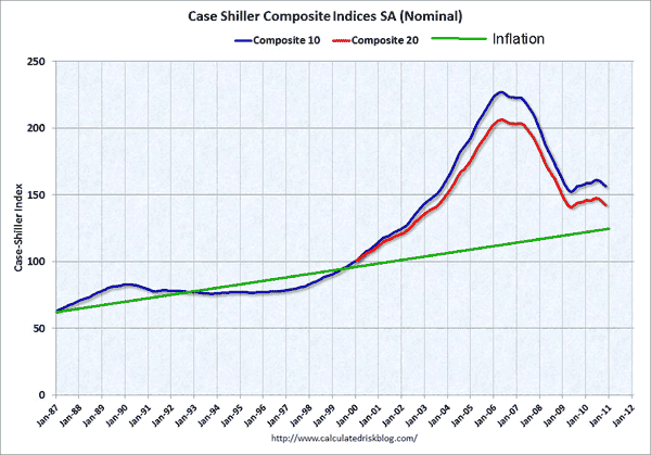
So what are the specific the differences between the Shiller-100 and the Case-Shiller 10 or 20 composite city models? I assumed the geographic locations for the data points were different, but don't both account for inflation?
Also, I checked Calculatedriskblog for this figure, and could only find ones WITHOUT an added inflation line. I'm guessing MarkInSF added this feature to the original graph. Kind of confusing for evaluating current house price levels if the Composite 10 and 20 curves are in fact adjusted for inflation.
BTW, here is the same chart with inflation
Here is an update with the latest blip.
http://www.ritholtz.com/blog/2010/07/updating-the-case-shiller-100-chart-forecast/

I showed above that the median house in the US from 1940 was about 900 SF and should cost $50,000 in 2000. The median house in the US in 2000 was 2100 SF and cost $120,000. The ratio 120,000 / 50,000 is 2.4. That is about the ratio of the square foot increase (2100 / 900 = 2.3). So, CS predicts an increase from 30,000 to 50,000, and the rest of the price increase is due to houses increasing in size.
I lived in a house in SoCal for the last 3 years that was built in 1938. It was fairly upscale relative to the other houses nearby that lasted that long. It sold for $88,000 in the late 90s, went up to $400,000 and back down to around $200,000 since then. It is 1370 SF, so maybe 1.5 times the average size from that time. And, in 2000, it sold for about 1.5 times the $50,000 value.
What you have to think about is that many of the houses from 1940 have been replaced. The ones that are still standing represent the better portion. They are the Darwinian survivors of the wrecking ball, and are probably not accurate representations of the median house from 1940.
CS does not try to predict the price of the median of the 1940s house still standing.
And yet that is precisely what it claims to predict. Read the chart"
"...to track the value of housing as an investment over time"
If it doesn't predict the value of an unaltered home purchased in 1950 or whenever, then what exactly is it's use?
Also, I checked Calculatedriskblog for this figure, and could only find ones WITHOUT an added inflation line. I’m guessing MarkInSF added this feature to the original graph. Kind of confusing for evaluating current house price levels if the Composite 10 and 20 curves are in fact adjusted for inflation.
The composite 10 and 20 are not adjusted for inflation. That's why I added the inflation line. I also just drew the line straight from 1987 to today, based on CPI. Obviously it's not a straight line like that.
Wow, astounding to see this thread has generated so much concentration. And here I thought it was a simple matter of chart updating.....
If I were to take Ritholz updates as reasonable though, looks like 2015 before things are "normal".
LOL. Reading further, this is looking a little like a flame war over an pretty niche topic. If I am wrong on this, thanks to those of you that are putting in the effort to try to set me straight.
So the Case-Shiller index measures exactly what?, and this measurement is applicable to my real life how? In as few words as possible. . . .
Case-Shiller tries to show how your investment will appreciate over time if you buy a house. It measures how an individual purchase in the past would have appreciated over time (if it is typical of the region being measured, national or one of the cities). Obviously, a landlord would have to take into account rent and upkeep. The chart is showing how the appreciation part has changed over the years.
That 1100 ft2 is not from the census. Also, it is an estimate of houses build in the 1940s and 1950s, so call it representative of new houses in 1950 (smack in the middle of the 40s and 50s). Yet, you insist that it is exactly what the average house was in 1940, and that 900 SF is too small.
If you want to be so nit-picky and insistent, then you ought to be more precise.
1. coastal california prices have of course outpaced inflation for a generation. that is sort of a natural fact, as these cities increased in density in far more drastic manners than probably anywhere else in the US save New York.
See, but here's the thing: It would seem to me the average property from 1940 is in an area that has increased in density, for the simple reason that density as a whole has increased. People haven't just spread out - though clearly there is a lot of that, they've gotten more dense within the original habitation limits from 70 years ago, and that's where all the homes from 70 years ago are (by virtue of being in the original habitation limits before sprawl). Sure coastal CA and NY are extreme examples, but density overall is up in the areas where 1940's homes were.
I have acknowledged that it is POSSIBLE that different areas appreciate at different rates, but that is a far cry from you showing any quantifiable, non-anecdotal evidence.
Wow. You are one tough customer if you won't even concede that. I give up.
10. What housing sales are excluded from the index calculation?
The indices measure changes in housing market prices given a constant level of
quality. The repeat sales method limits the effect that changes in the types and
sizes of houses sold or changes in the physical characteristics of houses have on
the indices. Filters are used to maintain the integrity of the index as an indicator
of market trend. These filters identify and exclude: non-arms length transactions
(e.g., property transfers between family members); transactions immediately
preceding or subsequent to substantial physical changes to a property;
http://www2.standardandpoors.com/spf/pdf/index/SP_Case_Shiller_Home_Price_Indices_FAQ.pdf
The "transactions immediately preceeding" bit has always bugged me. Why should it be excluded just because a developer bought the property? Not to mention, if a developer buys a property to develop it, it's likely because the land value has gone way up, and the existing structures are no longed a best economic use.
I have acknowledged that it is POSSIBLE that different areas appreciate at different rates, but that is a far cry from you showing any quantifiable, non-anecdotal evidence.
Wow. You are one tough customer if you won’t even concede that. I give up.
Huh? I said different areas can appreciate at different rates. I conceded it, then you said I won't concede it and you give up?
Whatever, dude...
Shiller went out on a limb and correctly predicted the crash at a time when every other mainstream media source was saying "real estate always goes up", "it's a new economy", "it's different this time", "not here", and even after the impending crash was obvious, still saying "soft landing". If one is claiming the chart that did this is nonsense, I think it's contingent on THAT person to prove it.
Shiller went out on a limb and correctly predicted the crash at a time when every other mainstream media source was saying “real estate always goes upâ€, “it’s a new economyâ€, “it’s different this timeâ€, “not hereâ€, and even after the impending crash was obvious, still saying “soft landingâ€. If one is claiming the chart that did this is nonsense, I think it’s contingent on THAT person to prove it.
That he called the housing bubble is irrelevant to the question. Shiller is a very smart guy, but I just don't think the data he collected, with the methodology he used of specifically excluding transactions where redevelopment was done on the land, tells the story that he says it does.
By the way, Shiller was hardly alone. None other than The Economist magazine was running articles on the housing bubble starting in 2003, and even ran a few cover stories, the one in 2005 calling it the "biggest bubble in history."
Obviously it was hyperbole for me to say "every other mainstream media source". Of course Shiller was not literally the only person who predicted the crash. I wouldn't say "hardly alone" though. There were a number of bloggers who called it, but I still say he was, among the mainstream media, alone for the most part, with the notable exception you have mentioned.
For 1890 to 1934, Mr. Shiller used data from a trio of economists led by Leo Grebler. Because he found no index for 1934 through 1953, Mr. Shiller wrote, "I had my research assistants fill that gap by tabulating prices in for-sale-by-owner ads in old newspapers," covering just five cities. For 1953 through 1975, Mr. Shiller used an index compiled by the U.S. Bureau of Labor Statistics, or BLS. An index from the regulator of Fannie Mae and Freddie Mac covers the period through 1986, after which Mr. Shiller uses the S&P/Case-Shiller index he created with another economist, Karl Case.
http://online.wsj.com/article/SB124051414611649135.html
OK, so the methodology for 1934-1953 is laughable.
From 1953-1986, the chart is not using any methodology Shiller came up with at all. I though the were trying to use sales pairs, just with less reliable data, but they didn't even do that. It's just using government statistics. I'm curious what exactly those indexes referred to are, but I don't think it's too wild a statement to say that that they were NOT designed to track the value of a home as an investment over time, like the Case Shiller methodology is.
I've already stated my beef with C/S methology, that's was used since 1987, and how it would underweight the appreciation of raw land value component of a homes value, but on short time scales like a decade or two, I doubt it makes much difference, unless you're looking at a boom town like Bend Oregon.
Wow, MarkInSF, I had given up on this thread. Thanks for posting the pre-1987 methodology; I actually learned something. And no, I won't throw out my dogeared inflation adjusted Shiller long chart that I carry around in my wallet -- yet. In the mean time, I've got a house along a canal in Amsterdam that I'd like to sell one of you... oh, my head.
. I also don’t know what “excluding transactions where redevelopment was done on the land†means...In the meantime, until you explain that, I would say that if the methodology is to use matched sales pairs,
Simply put, C/S does not include a sales pair if the the end sale is bought by a developer (maybe splitting the property into 2 or ten properties, or into some other more economic use like a condo). When is that most likely to happen? It's when the value of the land has gone way up - even beyond inflation, to the point it makes economic sense sense to redevelop it.
If you have a town that used to be 10 acre family farms, and over time they were all redeveloped and sold to families in 1/2 acre plots, what do you think happens to the value of the land to the one holdout who keeps his 10 acre farm while the town grows up around him over 50 years? It will go up a lot faster than inflation, that's for sure. But when that last holdout finally sells his home to a developer, for a price the has dramatically outpaced inflation, Case & Shiller choses not to include this sale in their data.
That's an extreme example, but the same things happens on a smaller scale all the time. Not enough to make a huge difference in the short fun, since most transactions are not to developers, but over long periods a significant portion of properties have been redeveloped.
Essentially, it excludes sales pairs exactly when their appreciation is most likely to have been dramatic.
Mark,
If a 10 acre lot is sold to a developer, then the developer divides it into 20 1/2 acre lots as in your example, the first sale from the original owner of the 10 acre lot to the developer counts. That is representative of appreciation of the original house.
The next sale from the developer to the new owner of a 1/2 acre lot is excluded. The assumption is that the developer built a house on the lot, so that price is not due to appreciation.
I'm sure that there are some issues where positive appreciation is excluded. There are probably also cases where some improvement sneaks in. Hard to say what the net effect is.
If a 10 acre lot is sold to a developer, then the developer divides it into 20 1/2 acre lots as in your example, the first sale from the original owner of the 10 acre lot to the developer counts. That is representative of appreciation of the original house.
Hmmm. That's not entirely clear to me.
The pairing process is also designed to exclude sales of properties that may have been subject to substantial physical changes immediately preceding or following the transaction....Transactions where the seller may be a real estate developer (based on the seller’s name) are also excluded, since it is likely that this is the sale of a newly constructed home built on a previously vacant or occupied lot or a rebuilt existing home.
Buying for subdividing sounds a lot like a substantial physical change immediately following the transaction, but it is only specific about developers with regard to them being the seller.
The next sale from the developer to the new owner of a 1/2 acre lot is excluded. The assumption is that the developer built a house on the lot, so that price is not due to appreciation.
Hmmm... If you're right, I think I see where the of lot of the value of land appreciation went, that seems to be missing from the Shiller chart over time: into the developers pocket.
By the way, Shiller was hardly alone
Actually he was very much alone. His book Irrational Exuberance 2nd edition came out in 2005. However he did make many appearence on CNBC as well as write a couple articles around 2002 and 2004. Around that time, he was the only one talking about "bubbles" and much laughed at.
http://www.businessweek.com/bwdaily/dnflash/aug2002/nf2002082_7132.htm
Home Is Not Where the Returns Are AUGUST 2, 2002
"The fear doesn't seem irrational, especially with signs that the economy is rapidly losing momentum. Home prices are unhinged from the economic fundamentals in some parts of the country, such as the San Francisco Bay Area. "The clearest case of a speculative bubble in the U.S. recently, I believe, is the Bay Area -- San Francisco, Oakland, San Jose, Silicon Valley -- where prices were rising at a tremendous clip," says Robert Shiller, economist at Yale University."
MarkInSF, YesYNot - you seem to disagree on whether these sales pairs are excluded or not, so I don't know who to believe here.
Mark, the post before that is intriguing, and I will definitely take a look at that article.
The CPI data used for 1953 to 75 is based on homes with constant age & size, because they were trying to measure increases in cost of living for the same quality items.
That's not the same as a "same home" sale. BLS is trying to track inflation. If I'm trying to judge the price of a 1200sft, 30 year old home over time, the average 30 year old 1200sft home is going to move AWAY from the center of an metropolitan area.
Why? Simple. All the old homes are at the center of a metropolitan area, since they were buit first, and newer homes were built on the outskirts.
Now, I think it's pretty well known that housing that is more central is more expensive than outlying housing. While BLS controls for size and age of the housing, it does not at all control for the desirability of the location.
To take the 30 year old home example again: In 1950 BLS would be looking at the price of a 1200sft home built in 1920 in San Francisco. Today it would be comparing it to the price of a 1200sft home built in Pleasanton in 1980.
That looks a lot like apples and oranges to me.
game, I think that both the Shiller and Lawler plots are reasonable. Shiller himself isn't sitting around calling for a reversion right back to 100 on his graph. A little while back, he was saying that another dip was possible, but that prices could continue up as people get excited again.
I've been guessing that prices still have some falling to do based on the Shiller plot, but am unsure. That is why I spent so much time on this thread.
By the way, Shiller was hardly alone
Actually he was very much alone. His book Irrational Exuberance 2nd edition came out in 2005. However he did make many appearence on CNBC as well as write a couple articles around 2002 and 2004. Around that time, he was the only one talking about “bubbles†and much laughed at.
http://www.businessweek.com/bwdaily/dnflash/aug2002/nf2002082_7132.htm
Home Is Not Where the Returns Are AUGUST 2, 2002
“The fear doesn’t seem irrational, especially with signs that the economy is rapidly losing momentum. Home prices are unhinged from the economic fundamentals in some parts of the country, such as the San Francisco Bay Area. “The clearest case of a speculative bubble in the U.S. recently, I believe, is the Bay Area — San Francisco, Oakland, San Jose, Silicon Valley — where prices were rising at a tremendous clip,†says Robert Shiller, economist at Yale University.â€
If you are trying to support the notion that Shiller is great at predictions, I wouldn't link an article that shows he was early by 5 years in calling the peak, not to mention the fact that for some parts of the BA, he's still just flat out wrong and prices are well above their 2002 prices.
For 1890 to 1934, Mr. Shiller used data from a trio of economists led by Leo Grebler. Because he found no index for 1934 through 1953, Mr. Shiller wrote, “I had my research assistants fill that gap by tabulating prices in for-sale-by-owner ads in old newspapers,†covering just five cities. For 1953 through 1975, Mr. Shiller used an index compiled by the U.S. Bureau of Labor Statistics, or BLS. An index from the regulator of Fannie Mae and Freddie Mac covers the period through 1986, after which Mr. Shiller uses the S&P/Case-Shiller index he created with another economist, Karl Case.
This is good to know. After all that heated exchange, it's nice to see some factual information on Shiller's data sources.
roberto,
I guess the fact that the article said that prices were at a peak twice and used Shiller's comments to support this lead me to believe that someone saying the BA is in a speculative bubble meant that an impending burst of the bubble was near. So the fact that Shiller said the BA is in a speculative bubble in 2002 and now we're in 2011 with prices higher than 2002, what does this tell us about his predictive skills? Are you saying he doesn't predict, and anything he creates should not be used for predictive purposes?
Shillers long term chart is for the US, and shows a $30,000 house in 1940 (adjusted for inflation) going for $50,000 in 2000. The median sales price over that time went from $30,000 to $120,000
Whoa, threre. Let's stick with the section of the graph that's based on BLS data I think I've already shown 1940 to 1953 data is highly suspect. 1953 to 75 was the BLS data.
The Shiller/BLS chart shows housing prices going slightly DOWN in inflation adjusted terms from 1953-1975. If I linearly interpolate the decade census data, it shows the median home price going up by 42% in those 22 years.
Does improvements in the median home account all that 42% rise? Possible... but that's would be awful lot of old homes torn down, and/or modern homes built in 22 years. The housing stock likely grew by about 34%, given the population did too. I'm not even sure that if the newly added housing stock was double the real construction costs of the median 1953 home it could budge the median by 42%.
Another data check: http://www.census.gov/const/pricerega.pdf shows the inflation adjusted median home price going up 24% from 1963-1975. BLS/Shiller show adjusted homes prices almost exactly flat over the same time period. Does improvements in size and plumbing or what have you account for a 24% difference in the median home price in just 12 years, given that the housing stock could not have changed that significantly? I find that much harder to believe.
Shiller asserting the the BLS data tracks the expected appreciation of a home standing in 1953, until 1975, seems highly suspect to me.
« First « Previous Comments 19 - 58 of 63 Next » Last » Search these comments
Say, has anyone updated the Shiller graph recently?
All I find when I web search is this old one with projected lines, where's the actual?
http://patrick.net/housing/contrib/housing_projection.html
#housing